brand design
brand design
brand design
ssut rebrand
brand design
product design
graphic design
I collaborated with the organization formerly known as the PEACE Volunteer Center at the University of Tampa to completely rename and rebrand their entity. Their previous logos, name, and visual assets lacked cohesion and power, which led to confusion across campus and low student engagement. I was brought on to research the core drivers behind this disconnect and design a solution that better represented their mission. The result was a total transformation into Spartan Service UTampa, anchored by a bold new logo system that strictly aligns with university brand guidelines while helping the organization stand out, build trust, and operate with maximum clarity.


SSUT rebrand
SSUT Rebrand
brand design
brand design
I collaborated with the organization formerly known as the PEACE Volunteer Center at the University of Tampa to completely rename and rebrand their entity. Their previous logos, name, and visual assets lacked cohesion and power, which led to confusion across campus and low student engagement. I was brought on to research the core drivers behind this disconnect and design a solution that better represented their mission. The result was a total transformation into Spartan Service UTampa, anchored by a bold new logo system that strictly aligns with university brand guidelines while helping the organization stand out, build trust, and operate with maximum clarity.
I collaborated with the organization formerly known as the PEACE Volunteer Center at the University of Tampa to completely rename and rebrand their entity. Their previous logos, name, and visual assets lacked cohesion and power, which led to confusion across campus and low student engagement. I was brought on to research the core drivers behind this disconnect and design a solution that better represented their mission. The result was a total transformation into Spartan Service UTampa, anchored by a bold new logo system that strictly aligns with university brand guidelines while helping the organization stand out, build trust, and operate with maximum clarity.
Driven by design thinking principles and comprehensive UI/UX user research, I executed a deep-dive investigation into why the former PEACE Volunteer Center identity failed to connect with the campus community. I developed and distributed multiple detailed surveys to students and faculty to gather qualitative and quantitative data, allowing me to pinpoint exact pain points around brand perception, clarity, and engagement. Alongside user data collection, I conducted in-depth strategic meetings with organization leaders and analyzed established non-profit and volunteer branding systems. This multi-layered research directly informed a strategic redesign engineered to eliminate user friction, align with University of Tampa brand standards, and maximize student participation.
The project delivered a complete brand overhaul, including the primary Spartan Service UTampa logotypes, circular badge emblems, and four specialized sub-icons for internal committees. Additional deliverables included social media design systems, weekly calendar templates, and brand usage guidelines for future student leaders.
The rebranding successfully eliminated confusion surrounding the volunteer center, providing a unified visual identity that significantly boosted campus visibility. By establishing structured templates and clear sub-branding, the organization elevated its professional image, streamlined its social media workflow, and created a far more inviting entry point for student engagement.
Driven by design thinking principles and comprehensive UI/UX user research, I executed a deep-dive investigation into why the former PEACE Volunteer Center identity failed to connect with the campus community. I developed and distributed multiple detailed surveys to students and faculty to gather qualitative and quantitative data, allowing me to pinpoint exact pain points around brand perception, clarity, and engagement. Alongside user data collection, I conducted in-depth strategic meetings with organization leaders and analyzed established non-profit and volunteer branding systems. This multi-layered research directly informed a strategic redesign engineered to eliminate user friction, align with University of Tampa brand standards, and maximize student participation.
The project delivered a complete brand overhaul, including the primary Spartan Service UTampa logotypes, circular badge emblems, and four specialized sub-icons for internal committees. Additional deliverables included social media design systems, weekly calendar templates, and brand usage guidelines for future student leaders.
The rebranding successfully eliminated confusion surrounding the volunteer center, providing a unified visual identity that significantly boosted campus visibility. By establishing structured templates and clear sub-branding, the organization elevated its professional image, streamlined its social media workflow, and created a far more inviting entry point for student engagement.
I am attending my senior year studying graphic design at The University of Tampa. I have been exploring new mediums and methods of creation / design that have helped greatly in my pursuit of passion and knowledge. Ontop of my schooling, I have been prototyping a series of personal endeavors. Which in turn has required me to push my knowledge in design and workload even further!
Absolutely! With CustomAccordion, you have full control over design elements like the background color, border radius, fonts, icons, and more. This allows you to integrate the component seamlessly into your project while maintaining a consistent look with your overall design.

The organization's legacy name and fragmented visual assets created significant friction and confusion among students, faculty, and community partners alike. Lacking a strong visual anchor or clear institutional connection, the former brand identity failed to communicate the center's core mission or stand out in busy campus environments. Transitioning to Spartan Service UTampa solved this issue directly. Paired with a bold, modern emblem system, the new name immediately anchors the organization within the university's identity while providing a recognizable, authoritative mark. This refreshed visual hierarchy gives the organization the professional presence needed to cut through campus noise and clearly signal its purpose to prospective volunteers.
The organization's legacy name and fragmented visual assets created significant friction and confusion among students, faculty, and community partners alike. Lacking a strong visual anchor or clear institutional connection, the former brand identity failed to communicate the center's core mission or stand out in busy campus environments. Transitioning to Spartan Service UTampa solved this issue directly. Paired with a bold, modern emblem system, the new name immediately anchors the organization within the university's identity while providing a recognizable, authoritative mark. This refreshed visual hierarchy gives the organization the professional presence needed to cut through campus noise and clearly signal its purpose to prospective volunteers.
The organization's legacy name and fragmented visual assets created significant friction and confusion among students, faculty, and community partners alike. Lacking a strong visual anchor or clear institutional connection, the former brand identity failed to communicate the center's core mission or stand out in busy campus environments. Transitioning to Spartan Service UTampa solved this issue directly. Paired with a bold, modern emblem system, the new name immediately anchors the organization within the university's identity while providing a recognizable, authoritative mark. This refreshed visual hierarchy gives the organization the professional presence needed to cut through campus noise and clearly signal its purpose to prospective volunteers.


The updated visual identity combines structured geometric shapes with smooth, fluid linework to create a balanced emblem that honors both the university's heritage and the spirit of community service. Featuring an illustrated spartan figure set against a radiant, sunburst background, the icon reflects empowerment, action, and outreach. The accompanying typography uses a strong, clean sans-serif layout (available in both stacked and side-by-side configurations) to ensure optimal legibility and seamless application across campus media, merchandise, and digital campaigns.
The updated visual identity combines structured geometric shapes with smooth, fluid linework to create a balanced emblem that honors both the university's heritage and the spirit of community service. Featuring an illustrated spartan figure set against a radiant, sunburst background, the icon reflects empowerment, action, and outreach. The accompanying typography uses a strong, clean sans-serif layout (available in both stacked and side-by-side configurations) to ensure optimal legibility and seamless application across campus media, merchandise, and digital campaigns.

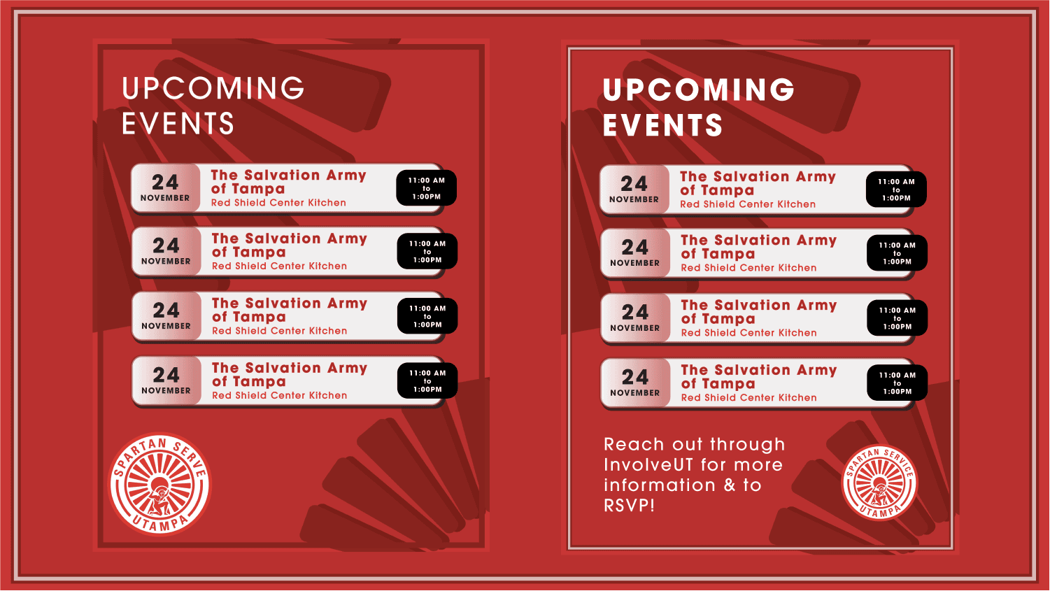
To support the various sub-initiatives and specific committees within the organization, I designed four specialized sub-icons that seamlessly integrate with the primary brand aesthetic. These distinct marks allow individual programs to maintain their own focus while immediately signaling their connection to Spartan Service UTampa. Alongside the sub-branding, I established structured design templates, such as the weekly event calendar shown on the right. Implementing cohesive graphic layouts across social channels transformed the organization's public presence, making communication feel significantly more professional, structured, and inviting to prospective student volunteers.
To support the various sub-initiatives and specific committees within the organization, I designed four specialized sub-icons that seamlessly integrate with the primary brand aesthetic. These distinct marks allow individual programs to maintain their own focus while immediately signaling their connection to Spartan Service UTampa. Alongside the sub-branding, I established structured design templates, such as the weekly event calendar shown on the right. Implementing cohesive graphic layouts across social channels transformed the organization's public presence, making communication feel significantly more professional, structured, and inviting to prospective student volunteers.